Motorola has officially made its latest wearable available, opening sales of the new Moto Watch through its U.S. online store. The announcement centers on availability and approachability, with the Moto Watch starting at $150, placing it squarely within reach of buyers who want smartwatch basics without committing to premium-tier pricing.
The Moto Watch joins Motorola’s growing accessories lineup, extending the brand beyond smartphones and into everyday wearables designed to fit naturally into daily routines. Availability through Motorola’s own storefront keeps the buying process straightforward, especially for customers already familiar with the brand.
A Smartwatch Built Around Everyday Use
The Moto Watch positions itself as a practical smartwatch rather than a feature-packed experiment. It is designed to handle the core expectations most users have from a wrist-worn companion: notifications, activity tracking, and at-a-glance information that reduces how often a phone needs to come out of a pocket.
Smartwatches in this category typically pair with a smartphone to mirror alerts, track movement, and offer lightweight health insights. The Moto Watch fits that mold, aiming to support daily habits rather than redefine them. The design cues suggest something meant to blend into regular wear, suitable for work, workouts, and downtime without feeling out of place.
By keeping the price at $150, Motorola signals that the Moto Watch is intended for a broad audience, including first-time smartwatch buyers or those who prefer simplicity over dense feature lists.
Where the Moto Watch Fits in Motorola’s Lineup
Motorola’s accessory strategy has leaned toward practical extensions of its mobile ecosystem, and the Moto Watch follows that pattern. Rather than positioning the watch as a standalone statement product, the company presents it as a natural companion to its smartphones and other accessories.
Selling the Moto Watch directly allows Motorola to frame it alongside its broader product family, reinforcing the idea of a cohesive setup rather than a single-purpose gadget. This approach aligns with the brand’s long-standing focus on usability and value, prioritizing everyday reliability over novelty.
CES conversations usually start the same way. A handshake. A greeting. A few familiar pleasantries before the real discussion begins. This one didn’t. When I first stepped up to LLVision’s booth, the person who greeted me didn’t speak English, and I don’t speak Chinese. Under normal circumstances, that would have meant a polite smile, a brief pause, and an awkward wait for someone else to step in.
Instead, we talked.
Not perfectly. Not fluently. But clearly enough to exchange ideas, explain what we were doing there, and set the stage for a more formal presentation later. That short conversation happened because of the LeionHey2, and it immediately reframed what I thought this product was actually about.
Why LLVision Belongs at CES
LLVision makes sense at CES for the same reason some of the most interesting brands do. They’re not chasing spectacle. They’re solving a very specific problem with a very specific tool. CES gives them a global stage where practical technology still has room to prove itself.
As an AR company, LLVision could have easily leaned into futurism or abstract demos. Instead, their focus felt grounded. This wasn’t about immersive worlds or experimental interfaces. It was about communication, something far more universal and far more difficult to solve cleanly.
An Unscripted Demo That Actually Mattered
Before any formal walkthrough or presentation, the Hey2 effectively demonstrated its value in the most unplanned way possible. The glasses allowed real-time translation and captions to appear in my field of view, enabling a brief but genuine exchange between two people who otherwise would not have been able to communicate at all.
It wasn’t flashy. It wasn’t perfect. It was useful.
That distinction matters. A lot.
Slipping the glasses on for a real-time review.
The Hey2’s Singular Focus
What immediately stood out to me about the Hey2 is what it doesn’t try to be. These aren’t glasses attempting to replace your phone, overlay your entire world with digital clutter, or serve as an all-purpose computing platform. They do one thing, and they do it intentionally: help people understand each other across language barriers.
I’ve always been drawn to products that embrace focus over ambition. The Hey2 feels designed around a clear use case, real-time translation and communication support, and everything else steps aside to serve that goal.
That restraint is rare in AR.
AR Without the Burden of Being “Everything”
The AR space has a history of trying to do too much at once. Navigation, notifications, entertainment, productivity, social interaction. The result is often a product that struggles to justify its own existence outside of demos.
The Hey2 avoids that trap. By narrowing its scope, it becomes easier to imagine wearing these glasses for a real purpose. Travel. International work environments. Conferences like CES itself. Any situation where language becomes friction instead of background.
The fact that my first interaction with LLVision happened through the Hey2 made that use case feel immediate rather than theoretical.
Same size and footprint of traditional eyewear
A Brand Rooted in Utility
Once the formal presentation began, the broader picture of LLVision came into view. This is a company with deep roots in enterprise and applied AR. Their background shows in how they talk about products. Less fantasy, more function.
The Hey2 feels like a natural extension of that mindset. It’s AR used as an accessibility and communication tool rather than a lifestyle statement. That doesn’t make it boring. It makes it credible.
Why the Simplicity Works
One of the most appealing aspects of the Hey2 is that it doesn’t ask you to learn a new way of interacting with the world. You speak. You listen. The glasses assist quietly. There’s no expectation that you’ll constantly engage with menus or controls.
That’s important for wearability. The more a device demands attention, the harder it becomes to justify keeping it on your face. The Hey2 fades into the background just enough to be helpful without becoming a distraction.
CES as the Perfect Test Environment
CES is an ideal stress test for a product like this. It’s loud. It’s crowded. It’s multilingual by default. Conversations happen quickly and often without preparation. If a translation-focused AR device can provide value here, it’s doing something right.
Seeing the Hey2 work in that context made it easier to imagine how it could function in airports, trade shows, international offices, or even casual travel situations.
Comfort and convenience with no buttons to worry about.
Not Trying to Win the AR Race
What impressed me most about LLVision is that they don’t seem preoccupied with winning the broader AR race. They’re not positioning the Hey2 as the future of computing or the next platform shift. They’re positioning it as a tool.
That mindset often leads to better products. When success is measured by usefulness rather than attention, design decisions tend to feel more honest.
A Quiet Confidence
The booth experience reflected that same philosophy. There was no rush, no inflated promises, no attempt to oversell what the product could do. The technology was allowed to speak for itself, and in my case, it literally did.
That first conversation, brief as it was, ended up being the most memorable part of the visit.
One I’ll Be Watching Closely
I left LLVision’s booth thinking less about AR as a category and more about AR as a helper. The Hey2 isn’t trying to redefine reality. It’s trying to reduce friction between people, and that’s a far more compelling goal.
I like the idea of glasses that focus on one thing and do it well. The Hey2 embodies that philosophy in a way that feels practical, respectful, and quietly ambitious.
If LLVision continues down this path, prioritizing clarity over complexity, they may end up with something rarer than hype: a product people actually want to wear.
And at CES, that’s saying something.
A Deeper Dive
Separately from the showroom floor of CES, I was able to speak with a member Dr. Wu Fei, founder and CEO of LLVision. We discussed, among other things, the brand’s position, a few specific details on the Hey2, and its focus for 2026 and beyond. Click here to read the interview.
I recently had the opportunity to speak with Dr. Wu Fei, founder and CEO of LLVision. After spending time with the company’s newest product, the Leion Hey2, at CES 2026, I was also able to test it firsthand. That brief, hands-on crash course made LLVision’s positioning for the wearable immediately clear. I recommend checking out the companion article for a closer look at the device itself.
Read on to learn more about the brand, its vision for 2026 and beyond, and how the Leion Hey2 aims to stand out in the increasingly crowded AR wearables space.
For readers who may be new to your brand, how would you describe what you do and who you build products for?
LLVision is an augmented reality (AR) technology company founded in 2014 in Beijing, China. We’ve spent over a decade focusing on AR and AI solutions for real-world applications, especially multilingual communication. In 2022, we launched the first-generation Leion Hey. It has shipped over 30,000 units worldwide and was recognized with a Netexplo Innovation Award at UNESCO’s Netexplo Forum 2022.
Our designs and technologies have also been recognized in Fortune’s Best Designs of 2023 and highlighted in Harvard Business Review’s 2024 tech trends. So, while we might be a new name to some U.S. readers, we have a strong track record in AR. We build our products for anyone who needs to communicate across language barriers – from global travelers and business professionals to educators and beyond. Essentially, we’re all about using AR technology to bridge language gaps in everyday life.
What problem or frustration originally pushed you to create this brand or product line?
The spark behind Leion Hey wasn’t just a desire for new technology; it was a response to a fundamental human challenge: the isolation caused by hearing and language barriers.
In the late 2010s, we spent extensive time within the Deaf and hard-of-hearing community, observing the “friction” that occurs when natural communication fails. We saw how lip-reading falls short in fast-paced environments and how phone-based translation apps force people to look away, breaking the human connection. To solve this, we initiated the Leion Hey AR project in 2019 with a singular focus: to move information from a handheld screen into the wearer’s natural line of sight.
This journey of “Accessibility First” gained global recognition, earning the UNESCO Netexplo Innovation Award in 2022. But we didn’t stop at the hardware. Our commitment to long-term impact led to academic research that received the AIS Impact Award 2025, proving that AR can fundamentally change lives. Today, we have expanded this technology to help anyone overcome language barriers. Our mission remains: ensuring technology helps us stay present with one another—head up, eyes forward—restoring the warmth and equality of every conversation.
The biggest frustration that drove us was seeing how language barriers still hinder genuine human connection. We noticed that when people who speak different languages try to converse, they often end up staring down at translation apps on a phone or relying on clunky translation gadgets. That breaks the natural flow of conversation and causes you to lose eye contact and human connection. In other words, technology was helping translate words, but it was also causing people to “look down” and for conversations to lose their authenticity. We started LLVision and the Leion Hey product line to change that. Our goal was to use AR to let people talk freely across languages while looking at each other, bringing back the dignity and natural warmth of face-to-face conversation.
Where do you see LLVision fitting into the broader tech or lifestyle landscape right now?
Today, the AR landscape is polarized: on one side, you have “camera-first” lifestyle glasses designed for social capture; on the other, you have heavy “spatial computing” headsets for immersive entertainment. LLVision occupies a distinct, high-value space: Professional-Grade Communication AR.
We don’t see Leion Hey2 as a multi-tool gadget, but as a specialized precision instrument. While others treat translation as just one of many “apps,” we have engineered the entire hardware and software architecture . This is why we offer sub-500ms latency and 6–8 hours of continuous translation—metrics that allow for a natural dialogue flow that general-purpose glasses simply cannot sustain.
Crucially, in a world increasingly wary of “always-on” surveillance, our camera-free design is a deliberate statement. It positions our brand as a “trust-first” companion. By removing the camera, we ensure the Leion Hey2 is socially and professionally welcome in environments where privacy is paramount—be it a high-stakes boardroom, a private medical consultation, or a quiet gallery visit. We aren’t just building another tech wearable; we are defining a new category of “Invisible Technology” that enhances human connection without getting in the way of it.
What are you announcing or showcasing at CES 2026, and why is this moment important?
At CES 2026, we are officially launching Leion Hey2 to the U.S. market. This is the world’s first pair of AR glasses engineered specifically for professional-grade translation. This moment is pivotal because it marks LLVision’s transition from a regional pioneer to a global contender. After shipping over 30,000 units of our first generation effectively creating the “subtitle glasses” category, we are now bringing a mature, refined solution to the global stage, proving that AR can be a daily productivity tool, not just a novelty toy.
How does this build on what you’ve released or learned over the past year?
The Leion Hey2 is a direct response to feedback from tens of thousands of users. We learned that for AR to be useful in serious conversations, endurance and privacy are non-negotiable. While our first generation validated the concept, users told us they needed a device that could last a full workday and be accepted in sensitive environments. That’s why we doubled down on power efficiency—achieving 6–8 hours of continuous translation—and made the bold decision to remove the camera entirely, ensuring the device is “socially safe” for everyone involved.
What’s the one update, feature, or shift you’re most excited to show publicly at CES this year?
We are most excited to showcase our “Invisible Tech” philosophy. It’s not just about a specific spec; it’s about the experience of wearing a 49g device that looks like classic eyewear. We want to show people that high-tech translation doesn’t require looking like a cyborg. The shift from “wearing a computer” to “wearing glasses that happen to understand languages” is the update we are proudest of.
Who is the Hey2 designed for, and what kind of user will get the most value from it?
Leion Hey2 is designed for “Cross-Border Connectors.” This includes international business executives, diplomats, and global travelers who need to build trust face-to-face. Additionally, given our company’s roots in accessibility, it provides immense value to the hard-of-hearing community. The user who gets the most value is someone who values eye contact and nuance over simply getting a transactional translation.
What does this do differently compared to what’s already on the market?
Unlike general-purpose smart glasses that try to do everything (music, video, photos) and end up with short battery life and privacy concerns, Leion Hey2 is purpose-built for one job: Communication. Hey2 was built from the ground up for face-to-face communication across languages. When someone speaks to you in another language, you’ll see their words as subtitles in your field of view, almost instantly (sub-500ms). This specialization allows us to offer superior accuracy and battery life that “Jack-of-all-trades” devices simply cannot match.
It’s completely hands-free and heads-up – no need to hold a device or wear an earpiece, so you can maintain natural eye contact. Also, Hey2 has no camera and no social media functions, which is very intentional: it focuses on translation without distractions, and people around you feel comfortable because there’s no camera pointed at them.
Are there any real-world use cases or scenarios that best highlight how it fits into everyday life?
Imagine a confidential business negotiation in Tokyo: you can’t pull out a phone to record, and wearing camera-glasses would be rude or banned. With Leion Hey2, you sit back, maintain eye contact, and see subtitles of your partner’s speech in real time. Or consider a visit to a museum in Paris—you can gaze at exhibits while the guide speaks, with translations floating in your periphery without glancing down at a screen. It seamlessly layers understanding over your reality.
Beyond these travel and business scenarios, Hey2 caters to a wide range of users: professionals in international teams or conferences can follow discussions in real time; educators and students in multicultural classrooms can communicate more effectively; and even public speakers can use it as a teleprompter for live translation or captioning. Another important group is the Deaf and hard-of-hearing – Hey2 can function as smart caption glasses to help them see what others are saying in real time.
Essentially, any situation where people are talking across different languages – meetings, trips, medical consultations, diplomatic events – is a scenario where Hey2 can help bridge the gap.
What’s the single message you most want readers to take away from your CES 2026 presence?
Language should no longer be a barrier to human connection. We have the technology to make multilingual communication as natural as speaking your native tongue – and Leion Hey2 is how we’re turning this vision into reality.
As the world’s first AI-powered AR smart glasses purpose-built for real-time translation,it converts spoken language into subtitles visible in your field of view, enabling natural, face-to-face communication across languages without looking at phones or interpreters. Unlike general AR glasses, Hey2 has no camera and no social media features, focusing solely on translation to keep conversations uninterrupted.
Hey2 delivers more languages, faster translation, and longer use than typical AR devices. It supports 100+ languages and dialects (bidirectionally) and achieves sub-500ms translation latency in real-world conditions. A single charge provides 6–8 hours of continuous translation, with up to 96 hours total using its charging case. Weighing just 49 g, with a classic browline design and adjustable nose pads, it’s light and comfortable for all-day wear.
If someone only remembers one thing about your announcement, what should it be?
Leion Hey2 is the Privacy-First, Professional AR translation glasses that you can actually wear all day.
How do you want people to feel about LLVision after reading about you this CES?
We want them to feel empowered and reassured. Empowered by the ability to understand anyone, anywhere. Reassured that there is a tech company that respects their privacy and prioritizes human connection over data extraction.
How CES set the stage for what’s coming next for your brand in 2026?
This launch establishes LLVision as a key player in the US market. In 2026, we plan to deepen our integration with localized service providers and expand our AI capabilities—moving from just “translating” to acting as an intelligent communication assistant that helps summarize and contextualize conversations.
Are there broader trends or shifts in the market that influenced this launch or direction?
Absolutely. Two major shifts: First, the “AI on the Edge” trend—processing AI on the device for speed and privacy, which is exactly what we do. Second, the growing backlash against surveillance. People are tired of being recorded. Our camera-free direction aligns perfectly with the market’s desire for “calm technology” that respects personal boundaries.
What excites you most about where your category is headed over the next year?
I’m excited about the normalization of AR. We are moving past the “early adopter” phase where people wore big, weird headsets. We are entering an era where smart glasses are just… glasses. Seeing Leion Hey2 worn naturally in coffee shops and boardrooms without anyone batting an eye—that is the future we are building.
When your app crashes, it’s like a store assistant suddenly fainting in front of customers. Awkward, disruptive, and bad for business. Crash reports from Google Play Console are your medical records, revealing what went wrong, where it happened, and how often it occurs. The real challenge is not accessing these reports, but knowing how to interpret and act on them strategically.
In this guide, I’ll walk you through a professional, structured approach to handling crash reports effectively, so you can improve app stability, protect your ratings, and create a smoother user experience.
Understanding Crash Reports and Why They Matter
Crash reports are automated logs collected when your application unexpectedly stops. They include technical details such as device model, Android version, stack trace, and error messages. Think of them as black boxes used in aviation. They don’t prevent accidents, but they tell you exactly what happened after one.
Why should you care? Because every crash is a frustrated user. Some will uninstall your app instantly. Others will leave a negative review. Over time, repeated crashes damage your reputation and reduce visibility in search results within the Play Store ecosystem.
By monitoring crash data regularly, you gain early warning signals. It’s like hearing a strange noise in your car before the engine fails completely. Addressing issues early saves development time, reduces churn, and strengthens trust.
Accessing and Navigating Google Play Console Crash Data
Start by logging into Google Play Console and selecting your app. Navigate to Quality > Android vitals > Crashes & ANRs. This section gives you a clean dashboard showing:
Crash rate percentage
Number of affected users
Top crashing devices
Android OS versions involved
You’ll notice two key categories: crashes and ANRs (App Not Responding). Crashes are sudden shutdowns, while ANRs occur when the app freezes for too long. Both harm user experience and deserve equal attention.
Click on any issue to view detailed stack traces, timestamps, and frequency patterns. This is where the real investigation begins.
How to Read Stack Traces Like a Pro
A stack trace may look intimidating, but it’s simply a breadcrumb trail. It shows the exact sequence of actions that led to failure. Focus on:
Your package name
The topmost error line
Method and class references
Ignore system-level entries at first. They’re often just witnesses, not culprits. Your code is usually the prime suspect.
Here’s a simple mental model: Error message = what failed Class name = where it failed Line number = exact location
Once you identify the problematic method, reproduce the scenario locally. Debugging without reproduction is like trying to fix a leak without knowing where the pipe is broken.
Prioritizing Which Crashes to Fix First
Not all crashes deserve equal attention. Some affect only one outdated device, while others impact thousands of users daily. Prioritize strategically using this framework:
High user impact – Crashes affecting many users
High frequency – Issues happening repeatedly
New version related – Problems introduced in recent updates
Critical app flows – Login, checkout, payments
To manage crash resolution workflows more efficiently, many development teams rely on structured service management platforms such as Alloy Software, which help prioritize incidents, assign tasks, and track fixes across development teams in a centralized system. Focus first on crashes that hit your core functionality. A crash on the splash screen is more dangerous than one hidden deep in settings.
Priority Matrix Table
Priority Level
Impact Scope
Action
Critical
Many users, core feature
Immediate hotfix
High
Moderate users
Fix in next update
Medium
Few users
Schedule later
Low
Rare edge cases
Monitor
This structured approach prevents chaos and ensures your development team works efficiently.
Using Filters and Trends for Deeper Insights
Google Play Console allows you to filter crashes by:
App version
Device model
Android version
Country
These filters help you uncover patterns. For example, if crashes only occur on Android 14 devices, you’ve narrowed your search significantly. It’s like realizing your plant only wilts when placed near the window. The environment matters.
Also review trend charts. A spike after a new release? That’s your smoking gun. Always compare crash rates before and after deployments.
Implementing Fixes and Validating Improvements
Once you’ve applied a fix, publish an update. But don’t stop there. Monitor the same crash entry after release. Has the frequency dropped? Has the issue disappeared completely?
For teams that need structured release validation and historical tracking, using IT incident management software helps automate monitoring, document fixes, and improve long-term app stability.
Validation is crucial. Otherwise, you’re just guessing. Think of it as checking your weight after starting a diet. Without measurement, there’s no progress proof.
Additionally, write clean commit messages referencing crash IDs. This builds a historical record that helps future debugging.
Preventing Future Crashes Proactively
Handling crash reports is reactive. Great teams go further and prevent issues before users feel them. Here’s how:
Add automated testing for critical flows
Use internal testing tracks before public release
Monitor memory usage and performance
Implement proper exception handling
A single list for proactive crash prevention:
Unit testing
Beta releases
Code reviews
Performance monitoring
Log validation
Prevention is cheaper than repair. It’s like wearing a seatbelt instead of relying on airbags.
Final Thoughts
Crash reports are not bad news. They are opportunities disguised as problems. Every error log is a user silently asking for a better experience. When you respond quickly, prioritize smartly, and monitor improvements, you turn frustration into loyalty.
Handling crash reports from Google Play Console is less about fixing bugs and more about building trust. Your users may never thank you for stability, but they will stay longer, engage more, and recommend your app.
The Yoga Tab has always occupied an unusual place in Lenovo’s lineup. It has never been the thinnest or flashiest device, and it isn’t exactly the easiest to explain on a spec sheet. Instead, it leaned into practical ideas that most tablet makers avoided.
I’m talking about things like the cylindrical battery spine doubled as a grip or the kickstand that’s always there when needed. Earlier models even doubled as portable HDMI monitors, blurring the line between tablet and tool. It’s a flexible, if not slightly unconventional experience that’s built on Android.
With the 2025 Yoga Tab, Lenovo steps away from that experimental streak and leans into refinement. The new design looks more conventional, but it also feels more intentional. This is Lenovo acknowledging how most people actually use a tablet today, while still quietly undercutting competitors where it matters most.
Rather than chasing ultra-premium pricing or novelty hardware, Lenovo focuses on performance, screen quality, and a bundled experience that does not require a return trip to the checkout page.
Lenovo traded the Yoga Tab’s quirks for clarity, and the result is a tablet that’s easier to live with every day.
Design: From Quirky to Clean
The first impression is how normal the Yoga Tab now looks. The cylindrical spine is gone, replaced by a slim, uniform aluminum body that would not look out of place next to a Galaxy Tab or iPad. That shift may feel like a loss to longtime Yoga fans, but it immediately makes the tablet easier to live with. I thought I would miss it more than I did.
At just over six millimeters (6mm) thick, the Yoga Tab slides into bags and sleeves without resistance. The weight feels well distributed, especially in landscape orientation, and extended handheld use is less fatiguing than older Yoga designs. The aluminum finish strikes a nice balance between grip and smoothness, avoiding both slipperiness and that overly matte feel that shows wear too easily.
The magnetic kickstand cover becomes essential rather than optional. It snaps into place with confidence, supports a wide range of angles, and holds steady even when typing or drawing. The ability to lay the tablet nearly flat adds real utility for note-taking and sketching. While it lacks the always-available convenience of the old integrated stand, it is far more flexible overall. Again, I thought that I’d have a harder time without it.
Display: High Refresh, High Confidence
Lenovo’s 11.1-inch LTPS display ends up being one of the Yoga Tab’s quiet strengths. The 3.2K resolution delivers sharp text and clean edges that make reading and document work comfortable for long stretches. The pixel density is high enough that individual pixels disappear entirely at normal viewing distances.
The 144Hz refresh rate defines how the tablet feels. Scrolling is fluid, animations are smooth, and transitions never feel rushed or choppy. This is especially noticeable when switching between apps, browsing long pages, or working with the stylus. Input latency is low enough that handwriting and drawing feel immediate rather than interpretive. It’s not quite a real-time “this feels so accurate” experience, but it’s perfectly serviceable.
Brightness levels are solid for an LCD panel, handling most indoor lighting and shaded outdoor use without strain. Color reproduction is vibrant without oversaturation, making the display well suited for media consumption and light creative work. Dark scenes reveal the limits of LCD contrast, but Lenovo’s tuning avoids washed-out blacks better than many IPS panels.
Performance: Flagship Power, No Apologies
The Snapdragon 8 Gen 3 processor puts the Yoga Tab firmly in the top tier of Android tablets. Is it too much? Hardly. This is not a case of overpowered silicon being wasted. The tablet consistently feels fast, responsive, and unburdened by its workload. It feels “right.”
Heavy multitasking does not cause hesitation. Jumping between a browser full of tabs, note-taking apps, messaging, and media playback feels seamless. Demanding games run smoothly at high settings, and the larger tablet chassis allows the processor and GPU to sustain performance longer than most phones using the same chip.
The combination of twelve gigabytes (12GB) of memory and fast UFS 4 storage gives the tablet plenty of breathing room. Apps stay resident, reloads are rare, and large files open quickly. The only real drawback here is the lack of expandable storage, which limits flexibility for users who rely on large local media libraries or offline files. But between the cloud and USB C-based external storage, there’s no real limit to worry about.
Software and Productivity
This is where the Yoga Tab separates itself from being just a powerful slab. Android 15 continues to improve tablet usability, and Lenovo builds on that foundation rather than reinventing it.
Multitasking feels natural. Split-screen and floating windows are easy to manage, and the taskbar provides consistent access to recent and pinned apps. System apps take advantage of larger layouts, making email, documents, and browsing feel less cramped than on older Android tablets.
Lenovo’s productivity mode is genuinely useful rather than aspirational. When enabled, the interface shifts into a windowed environment that behaves more like a lightweight desktop. Apps open in resizable windows, snapping feels predictable, and keyboard shortcuts work reliably. The Snapdragon 8 Gen 3 has enough overhead to keep this experience smooth, even with multiple windows active.
External display support adds meaningful flexibility, if only in theory for most users. But, for those who connect to a monitor, it’s always great to extend a workspace rather than mirroring it. Doing so allows the Yoga Tab to function as a compact workstation for writing, research, or communication-heavy tasks. This works especially well with the bundled keyboard and trackpad. The tablet feels closer to a small laptop replacement than most Android devices manage.
Smart Connect strengthens Lenovo’s ecosystem story. Clipboard sharing between tablet and Windows PC becomes second nature, file access is quick, and using the tablet as a wireless secondary display works well for reference material and chat apps. Latency exists, but it stays within tolerable limits for productivity.
Update support is solid, if not exceptional. Three major Android updates and four years of security patches provide reasonable longevity, though power users may wish Lenovo matched the longer commitments now offered by some competitors.
Accessories: Where the Value Really Shows
Lenovo’s decision to include both the stylus and keyboard in the box fundamentally changes the Yoga Tab’s value proposition. This is not an upsell-driven experience. What you need to be productive is already there.
The stylus feels precise and responsive, with pressure sensitivity that works well for both handwriting and creative tasks. Magnetic attachment keeps it from wandering, and wireless charging removes friction from daily use. The subtle haptic feedback adds a surprising sense of realism when drawing or writing, especially during longer sessions.
The keyboard cover is better than expected. Key travel is comfortable, spacing feels natural, and typing for extended periods does not feel like a compromise. The trackpad supports full gesture navigation and feels responsive despite its compact size. Lap use is limited by the kickstand design, but on desks and tables, the setup works reliably.
If you’re the type of user who likes to split time at a desk and the real world, I imagine you’ll enjoy having a PC-like experience at the office with all of the files and apps ready to head out the door at a moment’s notice.
Audio, Cameras, and Connectivity
Quad speakers deliver clear, balanced audio with enough depth to make movies and games engaging. Vocals are crisp, and stereo separation is convincing for a tablet of this size. It does not replace dedicated speakers, but it rarely feels lacking.
The front-facing camera is well suited for video calls, with a wide field of view and smart framing that keeps users centered. The rear cameras are functional rather than aspirational, excelling at document scanning and casual use. The macro camera adds little, but the main sensor handles its role competently.
Wi-Fi 7 support gives the Yoga Tab a clear advantage on modern networks, delivering low latency and high throughput. You’ll need to have a network in place that handles the throughput, but it’s also nice to be future-proofed a bit if you don’t. The removal of HDMI input and the headphone jack narrows the tablet’s appeal for certain power users, but USB-C display output and modern Bluetooth audio cover most mainstream needs.
Battery Life and Charging
Battery life aligns with expectations for a high-performance tablet. Mixed use comfortably fills a workday, and video playback stretches well beyond that. The tablet balances performance and efficiency effectively, avoiding the rapid drain seen on some flagship devices.
Fast charging helps offset the moderate battery size. The included charger restores most of the battery quickly, making short top-ups practical. Thermal behavior remains controlled, with heat spreading evenly across the chassis rather than concentrating in one area.
The Verdict
The Lenovo Yoga Tab (2025) is a reset done right. It gives up some of the Yoga line’s eccentric charm in exchange for broader usability and better balance. What remains is a tablet that feels purpose-built for real-world use rather than niche scenarios. And yet it still also manages to avoid feeling like just another tablet.
Awarded to products with an average rating of 3.75 stars or higher, the AndroidGuys Smart Pick recognizes a balance of quality, performance, and value.
Products with this distinction deserve to be on your short list of purchase candidates.
It delivers flagship performance, a smooth and responsive display, and a genuinely complete accessory package at a price that remains grounded. It does not try to outshine premium competitors on every spec, but it consistently offers more for the money once everything is considered.
For anyone looking for a capable Android tablet that can handle work, play, and creativity without additional purchases, the Yoga Tab emerges as one of the most sensible choices available today.
Typically priced about $550, I’m a big fan of this tablet and hybrid-like experience and think it’s a great value. As of the time this review was published, however, Lenovo is offering it at $450, which makes it an outright steal of a deal.
The POCO M-series used to be the safe bet for people who cared more about battery life and basic speed than polish. POCO phones already offer an incredible amount of bang for the buck, but at the entry level price range (M series) it really stretches that value proposition even further. That is to say it’s often a case of getting a mid-level experience for rock bottom prices.
The POCO M8 Pro 5G feels like POCO looked at that old playbook, shrugged, and stapled a few flagship-grade ideas right on top of it. It’s a midrange phone that leans hard into three things most people actually notice every day: a big, sharp AMOLED display, durability that borders on overkill, and a battery setup that makes charging anxiety feel outdated.
It also comes with a few very POCO trade-offs, especially in software clutter and camera versatility. But taken as a whole, the M8 Pro 5G lands as one of those phones that makes competing devices look a little too “normal” for the money.
The POCO M8 Pro 5G takes the old M-series value formula and reinforces it with real durability, a genuinely sharp AMOLED display, and a battery setup that changes how often you even think about charging.
Design and durability
The M8 Pro 5G looks and feels more substantial than older M-series phones, and that starts with the way it’s built. It isn’t trying to be featherweight. It’s trying to feel solid, and it succeeds.
The big headline is protection: IP66, IP68, IP69, and IP69K. That last one is the wild card. IP69K is the kind of rating typically associated with industrial equipment, not something sitting next to a bowl of keys on a kitchen counter. In practical terms, this is the rare phone where rain, spills, sinks, and even aggressive spray are not instant stress triggers.
Up front, Gorilla Glass Victus 2 is another “wait, really?” spec for the price tier. That does not mean it can skip a case forever, but it does mean it is built to survive normal life better than most midrange phones.
Ergonomics-wise, the quad-curved approach makes it easier to hold than its size suggests. It is still a big device, and at around two hundred six grams it has some heft, but the weight feels evenly distributed instead of top-heavy.
Display
This is one of the main reasons the M8 Pro 5G stands out.
It uses a 6.83-inch 1.5K AMOLED panel (2772 x 1280) with a 120Hz refresh rate. The 1.5K part matters because it sits in that sweet spot where text looks meaningfully sharper than typical 1080p midrangers, but without the battery tax that comes with a full QHD panel.
Brightness is also a strength. Between a high outdoor mode and a claimed peak spec that supports punchy HDR viewing, it’s built for real daylight use, not just “technically readable if you squint.”
Two smaller quality-of-life wins show up here too:
3840Hz PWM dimming for people who are sensitive to OLED flicker at low brightness
Wet Touch 2.0, which helps when the screen or hands are damp, sweaty, or caught in bad weather
Bottom line: this is a big, modern, high-contrast panel that makes streaming, scrolling, and reading feel like the phone cost more than it does.
Performance and Gaming
The POCO M8 Pro 5G runs on the Snapdragon 7s Gen 4, and its personality is “steady and capable” rather than “benchmarks and bragging rights.” For daily use, that’s exactly what most people want. Apps open quickly, the UI feels fluid, and multitasking stays composed.
Gaming is where expectations need to be set correctly:
Fast-paced shooters and well-optimized titles feel great, helped by the 120Hz panel and high touch sampling options
Heavier games like Genshin Impact are playable with sensible settings, but this is not a max-everything, never-drop-a-frame device
Thermals are handled by POCO’s IceLoop cooling approach paired with graphite, and the practical outcome is simple: sustained play tends to stay “warm” instead of “why is my phone doing hot yoga.”
Battery and Charging
This is the other headline feature, and it’s a big one.
POCO pairs a 6500mAh Silicon-Carbon battery with 100W charging (charger inclusion depends on region). The Silicon-Carbon piece is the quiet breakthrough because it helps pack more capacity into a body that isn’t comically thick. It also tends to behave better in cold weather than traditional battery setups, which matters more than people think if winters are part of the routine.
On charging, 100W makes the big battery feel far less intimidating. Instead of “giant battery, giant wait,” it’s more like “giant battery, short coffee break.”
There’s also a stated long-term battery health claim tied to charge cycle retention, which signals POCO is taking longevity more seriously than the old stereotype suggests.
Cameras
The M8 Pro 5G is a “main camera first” phone, and it wears that philosophy proudly.
The 50MP main camera (with OIS) is the workhorse. In good light, it has the dynamic range and sharpness most people want for travel photos, pets, food, and daily life. In low light, the combination of a bright aperture, stabilization, and modern processing helps it outperform the typical midrange baseline.
The compromises show up in the supporting cast:
The 8MP ultrawide is serviceable in daylight but does not hold up nearly as well when light gets tricky, and edge softness is part of the deal
The selfie camera can produce detailed results, but portrait behavior can sometimes require a little manual correction to get the look just right
Video tops out at 4K 30fps, which is fine for casual capture, and stabilization is helped by the OIS plus electronic assistance.
This is a strong “one-camera phone” in spirit, even if it technically has more than one lens.
Software Experience
The phone ships with HyperOS 2 based on Android 15. It generally feels quicker and more modern than older Xiaomi-era software builds, especially in animations and general responsiveness.
The ongoing annoyance is still here: bloatware and system-level ad surfaces in certain apps. The good news is that a lot of the preinstalled third-party stuff can be removed, and some ad behavior can be reduced with a bit of settings cleanup. The bad news is that it takes effort, and the out-of-box experience is not as clean as what someone gets on a Pixel or a more locked-down “no nonsense” Android skin.
Spend some time with the phone in the early days and you’ll surely figure out what’s not required, what’s valuable, and what can be tailored to taste.
Audio, Haptics, and Day-to-day Extras
Beyond the headline hardware, the POCO M8 Pro 5G stacks a long list of practical connectivity and system features that quietly add up in daily use. Bluetooth 5.4 improves efficiency and stability with modern earbuds and wearables, while Wi-Fi 6 and Wi-Fi 6E support help future-proof the phone for faster, less congested home networks.
Add in an IR blaster for controlling TVs and appliances, broad high-resolution Bluetooth audio codec support, stereo speakers with Dolby Atmos, and long-term software and security updates, and the M8 Pro feels less like a spec-driven midranger and more like a thoughtfully equipped device designed to age gracefully over several years of use.
I’m of the opinion that music shouldn’t be played from a phone in group settings, but there are many who disagree. Pair to a speaker or two if you’re looking to entertain; don’t rely on what’s inside of that tiny rectangle. Having said that, this is one of the louder and more impressive experiences I’ve seen at this price.
Haptics are upgraded from the old budget “buzzy coin motor” vibe, and unlocking is handled by an in-display fingerprint sensor that’s generally quick, even if placement can feel a bit low for some hands.
Connectivity and Buying it in the US
For US readers, the practical story is simple: this is an import device, and that changes the calculus.
On paper, it lines up best with T-Mobile and T-Mobile-based MVNOs because of the band support and typical VoLTE behavior. AT&T and Verizon are the usual trouble zones for imported phones, especially because of certification and whitelist behavior that can break calling even when data works.
Anyone considering it as a primary US phone should treat carrier compatibility as a required homework assignment, not a “probably fine” assumption.
The Takeaway
The POCO M8 Pro 5G is what happens when POCO takes the old M-series value formula and swaps “cheap and cheerful” for “tough, sharp, and fast-charging.” It delivers a genuinely premium-feeling display, unusually serious durability, and one of the more convincing battery experiences in its segment.
The trade-offs are also very POCO: software clutter takes some cleanup, secondary cameras are there because marketing insists they should be, and US buyers need to be realistic about carrier support and warranty logistics.
For buyers in supported regions, it’s an easy recommendation for anyone who wants a big-screen daily driver that can take a beating and still feel quick. For US buyers on T-Mobile who like import devices and do not mind tinkering, it can be a surprisingly satisfying “why did I spend more?” kind of phone.
Also worth Knowing: POCO M8 5G
POCO also sells the POCO M8 5G alongside the Pro model, and it’s best thought of as the slimmer, lighter, more straightforward sibling.
It keeps the same general vibe, but with a different set of priorities:
Thinner and lighter build (noticeably easier to pocket and hold)
A 6.77-inch FHD+ Flow AMOLED instead of the Pro’s larger 1.5K panel
Snapdragon 6 Gen 3 performance that’s solid for everyday use, but less ambitious for heavy gaming
A smaller battery with slower charging than the Pro, though still very respectable for all-day use
A more basic camera setup that leans even harder on the main lens
In short: the M8 Pro 5G is the “all-in” version built to flex on specs, while the M8 5G is the calmer, slimmer option for people who want the look and display benefits without chasing peak performance or max charging speed.
Pricing and Options
Awarded to products with an average rating of 3.75 stars or higher, the AndroidGuys Smart Pick recognizes a balance of quality, performance, and value.
Products with this distinction deserve to be on your short list of purchase candidates.
The POCO M8 Pro 5G is offered in two configurations, with the 12GB RAM and 512GB storage model priced at $359, while the 8GB RAM and 256GB storage variant comes in at $299. POCO M8 Pro 5G is available in three colors: Silver, Black, Green
The standard POCO M8 5G is positioned a step lower, with the 8GB RAM and 512GB storage option priced at $279, and the 8GB RAM and 256GB storage model available for $229. POCO M8 5G is available in three colors: Green, Black, Silver.
Weekends are when routines loosen up and gear gets a little more say in how things unfold. It’s when you notice which lights actually make your space feel inviting, which drinks keep you sharp without overdoing it, and which gadgets quietly earn a permanent spot in your bag or on your desk.
This Weekend Recommender roundup pulls together a mix of smart home upgrades, portable tech, and small indulgences that punch above their weight. We’ve had an opportunity to check out each of the following products and think they’re absolutely worth sharing.
None of these are impulse novelties. They’re the kinds of products that slide into everyday life and make it a bit more enjoyable, whether you’re dialing in your space, powering through a project, or unplugging once the work is done.
LIFX PAR38 Flood Light
If you’ve ever looked at your backyard, garage, or porch lighting and thought, “This could be doing more,” the LIFX PAR38 ($35) is your answer. It’s a high-output smart floodlight that blends brute brightness with the kind of color control normally reserved for indoor accent lighting. With up to 150-watt equivalent output and full RGB plus tunable white up to a crisp 9000K, it’s just as happy lighting a late-night grill session as it is bathing a wall in dramatic color.
No hub required here. It connects directly over Wi-Fi and plays nicely with Alexa, Google Assistant, and Apple HomeKit. Setup is straightforward, and once it’s in, the app gives you granular control over brightness, scenes, and scheduling. This is a great pick for homeowners who want functional outdoor lighting but still like to have a little fun with it. Once you’ve set the mood outside, it’s time to turn inward and fuel up.
Mocean Energy Drink
Mocean ($37 for 12-pack) lands in that sweet spot between “energy drink” and “hydration ritual.” It’s clean, lightly carbonated, and doesn’t hit you with the syrupy punch common in the category. The branding leans coastal and calm, but the formula is designed to keep you alert without the crash. Think caffeine with intention, not chaos.
What stands out is how drinkable it is. You can sip one during a long editing session or crack it open before a workout without feeling like you’re committing to a full stimulant event. The flavor profiles are restrained, refreshing, and easy to come back to, which matters if you’re trying to replace your second or third coffee of the day.
Mocean feels aimed at people who want energy support rather than a jolt. Remote workers, creatives, and anyone trying to stay sharp without overdoing it will appreciate the balance here. Properly caffeinated, you’re ready to play, which brings us to mobile gaming done right.
GameSir G8 Plus MFi Type-C Mobile Controller
Mobile gaming has outgrown touchscreen gymnastics, and the GameSir G8 Plus ($80) is proof. This is a serious, console-style controller built specifically for USB-C phones, with MFi support that makes it a natural fit for iPhone users dipping into Apple Arcade or cloud gaming services.
The design is ergonomic and expandable, securely gripping larger phones without feeling flimsy. Hall-effect analog sticks are the real headline here. They’re smooth, accurate, and resistant to drift, which is a big deal if you actually put hours into your games. Buttons are tactile, responsive, and spaced well enough for longer sessions without hand fatigue.
This controller is ideal for anyone who treats mobile gaming as more than a time-killer. Pair it with cloud streaming or native controller-friendly titles and suddenly your phone feels like a legitimate handheld console. When it’s time to step away from the screen, you’ll want something with a little more volume.
AGM MagROCK Bluetooth Speaker
The AGM MagROCK ($50) is built for people who are rougher on their gear than they’d like to admit. It’s rugged, weather-resistant, and designed to survive outdoor use without babying. The standout feature is the magnetic mounting system, which lets you stick it onto metal surfaces like grills, toolboxes, or gym racks with surprising confidence.
Sound quality leans punchy and clear, favoring volume and durability over audiophile nuance. That’s not a knock. This speaker is about convenience and resilience. Battery life is solid, Bluetooth pairing is quick, and the whole thing feels like it was meant to be tossed into a bag and forgotten until it’s needed.
It’s a great companion for backyard projects, camping trips, or garage workouts. And if you’re capturing ideas, notes, or content while you’re out and about, you may want something just as portable but a bit more focused.
BOYA Notra AI Voice Recorder
The BOYA Notra ($118) feels tailor-made for journalists, students, and creators who rely on voice notes but hate sorting through raw audio later. It’s a compact recorder that layers AI-powered transcription and organization on top of clean audio capture, turning spoken thoughts into searchable text with minimal friction.
Design-wise, it’s discreet and pocket-friendly, with one-button recording that makes it easy to capture ideas on the fly. The AI features are the real draw, helping turn interviews, meetings, or brainstorms into usable notes without hours of cleanup. For anyone juggling multiple projects, that time savings adds up fast.
If you spend your weekends recording, reviewing, and refining, the Notra fits neatly into that workflow. Once the work is done, though, it’s time to unwind, preferably with something that looks as good as it sounds.
Fender x Teufel ROCKSTER GO 2
The Fender x Teufel ROCKSTER GO 2 ($99) is what happens when classic rock aesthetics meet German audio engineering. It’s compact, portable, and wrapped in unmistakable Fender style, but the sound is surprisingly bold for its size. Strong mids, clean highs, and enough low-end presence to keep things lively make it a great all-rounder.
It’s also built for real-world use. Weather resistance, long battery life, and easy Bluetooth pairing make it a natural grab-and-go speaker. Whether it’s a park hang, a patio session, or background music while you cook, it delivers without demanding attention.
This one’s for people who care about design and sound in equal measure. It feels like a finishing touch rather than an afterthought, which is a fitting way to cap off this weekend’s lineup.
Since its debut some 13 years ago, the Moto G line has always been Motorola’s way of setting expectations for what a budget phone should feel like. Not flashy, not aspirational, but dependable and thoughtfully tuned for everyday use. The Moto G (2026) sticks closely to that playbook, even as competition in the sub two hundred dollar space grows sharper and less forgiving.
Let’s get it out of the way. This is not a phone that tries to outgun rivals on specs. You surely didn’t expect that out of the $200 device, did you? Instead, Motorola leans into comfort, endurance, and a sense of polish that feels intentional rather than accidental. That strategy mostly works, though a few compromises stand out more clearly than they did in previous generations.
Design and build: unexpectedly premium where it counts
The most immediate surprise with the Moto G (2026) is how it feels in hand. Motorola’s continued use of a vegan leather back is more than a cosmetic flourish. The soft, textured finish adds grip, resists fingerprints, and makes the phone feel secure without a case. It also avoids the cold, slippery sensation that plagues glossy plastic and glass-backed phones in this price range.
The Moto G (2026) succeeds by being honest about its priorities, even when those choices come with trade-offs.
The curved edges and gently integrated camera housing help the phone feel slimmer than its size suggests. While the frame itself is plastic, it is well finished and sturdy enough for daily use. This is one of those phones that feels designed to survive real life rather than live in a case from day one.
The front tells a more familiar budget story. Bezels are thick, especially along the bottom edge, and the LCD panel gives the phone a slightly dated look next to newer midrange devices. It is not offensive, but it does underline where Motorola chose to save money.
An IP52 rating provides light splash and dust resistance, which is better than nothing but well short of true peace of mind. This is a phone that can handle rain or a spill, not a drop into the sink or a plunge in the pool.
Display: Smooth Motion, Soft Details
Motorola made a clear choice with the display, and it will either resonate or frustrate depending on priorities. The 6.7-inch LCD panel runs at a 120hz refresh rate, which gives the interface a smooth, fluid feel. Scrolling, animations, and general navigation feel quick and responsive, even when the hardware underneath is modest.
The trade-off is resolution. At 720p, text and fine details lack the crispness expected in 2026, especially on a screen this large. Side by side with a full HD OLED panel, the difference is obvious. Colors are decent, brightness is adequate indoors, and outdoor visibility is serviceable, but this is not a display built for media enthusiasts.
Motorola is betting that fluidity matters more than sharpness for most buyers in this segment. That bet mostly holds for casual use, though it becomes harder to defend when competitors offer sharper panels at the same price.
And it’s here where I remember that reviewing a phone is hard to do in a vacuum. One cannot help but compare and contrast other devices, especially when you’re able to see and spend time with so many products. But, having said that, and donning my most subjective hat possible, I posit that 720 pixel resolution is more than acceptable for most people.
Performance: steady, predictable, and limited
The Moto G (2026) runs on familiar silicon, and it behaves exactly as expected. Everyday tasks like messaging, browsing, navigation, and streaming are handled without drama. The clean software experience helps mask hardware limits, and the high refresh rate adds a sense of responsiveness that benchmarks would not suggest.
Multitasking is where the constraints show. With 4GB of RAM, background apps are cleared aggressively. Jumping between multiple apps often triggers reloads, and heavier workflows quickly expose the phone’s ceiling. This is not a device for power users, and it does not pretend to be one.
Gaming is possible, but expectations need to be managed. Casual titles run well. Demanding games require low settings and still struggle to maintain consistent performance. The hardware is capable, but only within clearly defined boundaries. Heavier gamers are already looking elsewhere for their needs.
Storage, at 128GB with microSD expansion, is a bright spot. For users who store photos, music, or offline media locally, that flexibility still matters.
Motorola’s software approach remains one of its biggest assets. The interface stays close to stock Android, with just enough personality to feel considered rather than generic. Gesture shortcuts like the double chop flashlight and twist-to-open camera remain genuinely useful and are hard to give up once learned.
The out-of-box experience does require attention. Setup screens encourage optional app installs, and skipping carefully is the difference between a clean phone and one cluttered with third-party software. This is standard practice in the budget space, but it still detracts from an otherwise polished first impression.
Update support remains the biggest concern. Two platform updates and three years of security patches feel increasingly out of step with the market. Buyers who plan to keep a phone for several years should factor this in, especially when alternatives offer significantly longer support windows.
Then again, if you’re only spending $200 on a phone every two or three years, you probably don’t care that much about software. And it’s worth noting that the last few generations of Android have not been that revolutionary or packed with hot new features.
Cameras: Adequate Results, Limited Versatility
The main camera delivers predictable results. In good lighting, photos look pleasant and social-ready, with punchy colors and decent detail. Dynamic range can struggle in high-contrast scenes, and low-light performance is acceptable rather than impressive.
The secondary macro camera adds little real value. It exists more for spec sheet completeness than practical photography. The selfie camera is a noticeable improvement over previous generations, though image processing can be heavy-handed at times.
Video recording tops out at 1080p, which is fine for casual clips but unremarkable in a crowded field.
Battery Life: A Headline Feature
Battery life is where the Moto G (2026) earns its reputation. The large battery, paired with an efficient display and modest chipset, delivers consistently excellent endurance. Two full days of mixed use is realistic, and lighter users can push beyond that without stress. Not bad at all for a $200 phone.
Charging is reasonably quick with the right adapter, though the absence of a charger in the box complicates the value equation. Users without a compatible charger will need to factor in an additional purchase.
Wireless charging is absent, which aligns with the rest of the segment but still feels like a step backward compared to older Moto G models.
Connectivity and Extras: Practical, Not Flashy
The essentials are all here. Reliable sub-6GHz 5G, NFC for payments, stereo speakers that get loud enough for casual use, and a headphone jack that remains genuinely useful. Audio quality is fine rather than rich, but the flexibility matters.
Wi-Fi performance is solid for most households, even if newer standards are not supported.
The Final Take
The Moto G (2026) succeeds by being very clear about what it is and what it is not. It is not chasing spec-sheet bragging rights, and it is not trying to future-proof itself for half a decade. Instead, it focuses on the parts of the experience people actually touch every day: how the phone feels in hand, how long it lasts on a charge, and how smoothly it moves through the basics.
That focus gives the Moto G (2026) a distinct personality in a crowded budget field. The vegan leather back is not just a visual upgrade, it changes how the phone is used. The battery life is not merely good, it is genuinely freeing. The clean software and high refresh rate make the phone feel responsive even when the hardware underneath is modest.
Awarded to products with an average rating of 3.75 stars or higher, the AndroidGuys Smart Pick recognizes a balance of quality, performance, and value.
Products with this distinction deserve to be on your short list of purchase candidates.
At the same time, Motorola’s compromises are impossible to ignore. A 720p display on a large screen feels dated in 2026, and the limited software update promise puts a clear expiration date on the experience. This is a phone meant to be used confidently today, not stretched as far into the future as possible.
For buyers who want a comfortable, dependable Android phone that prioritizes battery life, grip, and day-to-day smoothness, the Moto G (2026) remains easy to recommend. For those who value display sharpness, camera versatility, or long-term software support, competing options offer a better return over time.
The Moto G (2026) does not redefine the budget category, but it reinforces why the Moto G name still matters. It delivers a thoughtful, livable experience built around real habits rather than aspirational specs, and for the right audience, that balance still works.
Cleer Audio has been steadily refining its take on open-ear audio, and the Arc 3 Sport Pro and Arc 3 Gaming are two of the newest additions to the company’s growing lineup. They arrive with a shared goal and a clear message: open-ear earbuds don’t have to be a compromise. Instead of isolating you from the world, these models are designed to keep you aware of your surroundings while still delivering the kind of sound, comfort, and feature depth that serious users expect. Where they differ is in who they’re built for.
At a glance, the Arc 3 Sport Pro and Arc 3 Gaming look like siblings. They use the same over-ear, open-ear design philosophy and share a lot of underlying tech. In practice, though, they’re tuned for very different lifestyles. One is made for motion, workouts, and biometric insight. The other is dialed in for speed, immersion, and long gaming sessions. Together, they show how flexible the Arc 3 platform really is.
One Design, Two Use Cases
Both earbuds rely on Cleer’s open-ear hook design, which sits just outside the ear canal rather than sealing it off. That means you can hear what’s going on around you without pulling an earbud out. For runners and cyclists, that’s a safety feature. For gamers, it means you’re not cut off from the room you’re in.
Comfort is a shared strength. The adjustable hinge system adapts to different ear shapes, and the lightweight construction keeps pressure and heat buildup to a minimum. These are earbuds you can wear for hours without the usual fatigue that comes with traditional in-ear designs.
Arc 3 Sport Pro: Audio With a Fitness Mindset
The Arc 3 Sport Pro ($200) is built around active use. Its defining feature is integrated health monitoring, with built-in heart rate and SpO₂ sensors that track key metrics directly from your ears. For many users, that means one less device to strap on before a workout. All of that data feeds into the Cleer+ app, where you can review performance and keep tabs on training intensity.
Sound quality is stronger than most open-ear designs manage. Large 16.2mm graphene drivers, paired with Snapdragon Sound and support for codecs like aptX Adaptive, aptX Lossless, and LDAC, deliver clear, energetic audio that holds up even outdoors. Dolby Atmos support adds a bit of spatial depth with compatible content, but the real value is consistent clarity without needing to crank the volume.
The Sport Pro is also built to take abuse. An IPX7 rating covers sweat, rain, and accidental splashes, and battery life lands at around 8 hours from the earbuds with another 32 hours from the case. The smart charging case adds wireless charging, a touchscreen interface, and UV-C sterilization, turning it into more than just a storage box.
This is the Arc 3 model for runners, gym regulars, and outdoor athletes who want awareness, durability, and health insights in one package.
Arc 3 Gaming: Tuned for Speed and Precision
The Arc 3 Gaming ($175) takes the same open-ear foundation and pushes it in a different direction. Here, the priority is responsiveness. The included USB-C dongle enables ultra-low latency, dropping audio delay to under 30 milliseconds. That keeps sound locked to on-screen action, which is critical for competitive and fast-paced games.
Audio tuning leans into positional awareness. The same 16.2mm graphene drivers are paired with gaming-focused EQ presets that highlight directional cues and environmental details. Dolby Atmos support, combined with head tracking via a 6-axis motion sensor, helps create a convincing sense of space in supported titles.
Battery life is even stronger here, with up to 10 hours from the earbuds and an additional 40 hours from the case. Like the Sport Pro, the Gaming model includes the touchscreen smart case, wireless charging, and UV-C sterilization. It also carries an IPX7 rating, making it surprisingly versatile outside of gaming sessions.
While it’s clearly designed with gamers in mind, the Arc 3 Gaming works just as well as an everyday open-ear earbud when you’re not plugged into a match.
Which Arc 3 Is Right for You?
The choice between these two newer Cleer Audio models really comes down to how you plan to use them. If your routine centers on workouts, outdoor training, and keeping tabs on your physical performance, the Arc 3 Sport Pro feels purpose-built for that life. If gaming is your primary focus and latency and spatial audio matter, the Arc 3 Gaming delivers a headset-like experience without the bulk or isolation.
What’s consistent across both is the core Arc 3 experience: comfortable open-ear design, strong audio performance, and a smart charging case that actually adds value. Together, these earbuds show where Cleer Audio is heading, and why open-ear audio is starting to feel like a real alternative rather than a niche experiment.
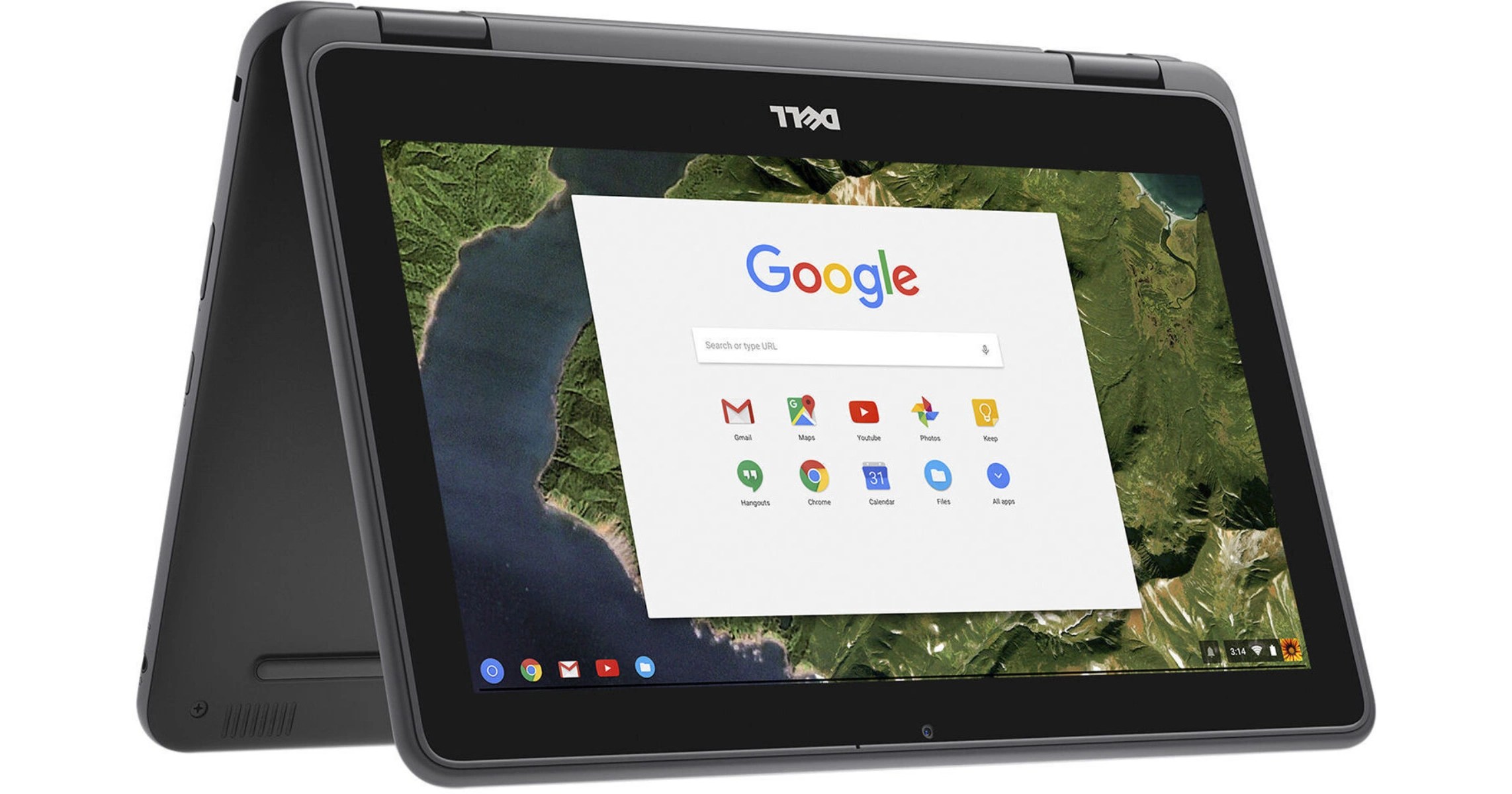
As the integration of Generative AI and emerging technologies signals a transformative shift in global pedagogy, Dell Technologies has announced a significant expansion of its education-focused portfolio. The company is introducing a new suite of ruggedized hardware and specialized skills programs designed to bridge the gap between traditional learning and the requirements of the AI era.
Engineered Resilience: New Hardware for Modern Classrooms
Dell’s updated portfolio, featuring the Dell Pro Education and Dell Chromebook series, prioritizes durability and longevity to protect institutional investments. These devices are engineered to meet MIL-STD 810H military standards, incorporating reinforced casing, spill-resistant interfaces, and high-cycle hinges.
Key hardware highlights include:
Performance: Optimized with Intel N-Series processors to ensure full-day battery life and seamless handling of modern curricula.
Serviceability: Designed with sustainability in mind, the units feature customer-replaceable components and shared parts across models to reduce electronic waste.
Connectivity and Security: Integration of Wi-Fi 6E and robust management protocols allows IT departments to deploy secure technology at scale.
The new lineup introduces the Dell Pro Education 11 (available as a laptop or 2-in-1) for early learners, alongside new 14-inch models available in both Windows and Chrome OS to provide older students with increased screen real estate for complex multitasking.
Beyond the Device: Cultivating Digital Literacy
Recognizing that hardware is only one component of the educational equation, Dell is expanding its global outreach through several targeted initiatives aimed at workforce readiness:
Career Readiness: The Tech Career Circuit, a collaboration with Discovery Education, provides middle and high school students with hands-on AI training and digital skill-building.
STEM Inclusion: The Girls Who Game program, supported by Intel and Microsoft, continues to foster leadership and technical interest among female students.
Technical Apprenticeship: The Student TechCrew enables high schoolers to manage peer-to-peer helpdesks, gaining professional hardware repair certification.
Specialized Learning: From Data Dunkers in Canada, which applies basketball analytics to data science, to serving as the technology partner for the U.S. Presidential AI Challenge, Dell is diversifying how students engage with complex data.
Leadership Vision and Global Availability
Kevin Terwilliger, Head of Product for Client Devices at Dell Technologies, emphasized that the company’s strategy focuses on fostering resilience and curiosity. “When we design technology for the classroom, we look beyond utility,” Terwilliger stated, noting that the new portfolio is built to meet the “real-world demands” of an evolving educational landscape.
The new Dell Pro Education and Dell Chromebook devices are scheduled for global commercial availability starting in February 2026.


 Review")


 Review")